
Digital payments have completely changed the way we handle our daily finances. Just a decade ago, most people relied heavily on physical cash for even the smallest transactions. Today, the landscape is different. A smartphone and a reliable internet connection are often all a person needs to navigate the modern economy.
The rapid adoption of the UPI app has been a significant driver of this change. While the underlying technology is impressive, the way users interact with these platforms is what truly builds trust. Design is not just about looking good. It is about creating a sense of security and ease that encourages people to move away from traditional cash.
Confidence in digital systems does not happen by accident. It is the result of careful planning and intentional interface choices. When a user feels that a platform is easy to navigate and transparent, they are much more likely to use it for larger and more frequent transactions.
The Psychology of Visual Trust
The first thing a user notices when they open a UPI app is the visual layout. Trust is often established in the first few seconds of interaction. Designers use specific colors and shapes to evoke feelings of stability and safety. For instance, many financial applications use shades of blue or green. Blue is often associated with professionalism and reliability, while green signifies success and growth.
A clean and uncluttered interface also plays a huge role in building confidence. If a screen is filled with too many buttons or confusing advertisements, a user might feel overwhelmed. This clutter can lead to a fear of clicking the wrong thing and losing money. By keeping the interface simple, designers help users feel that they are in total control of their funds.
Read More: How Instant UPI Apps Power Everyday Micro-Transactions
Icons also serve as a universal language. A small shield icon or a lock symbol near the payment section provides a subtle psychological nudge. It tells the user that their data is protected. These small visual cues work together to create an environment where the user feels safe to enter their sensitive information.
Streamlining the User Journey
The process of sending money should be as short as possible. Every extra step in a transaction is an opportunity for a user to feel anxious or for a technical error to occur. A well-designed UPI app focuses on reducing the number of clicks required to complete a payment. This is often referred to as reducing cognitive load.
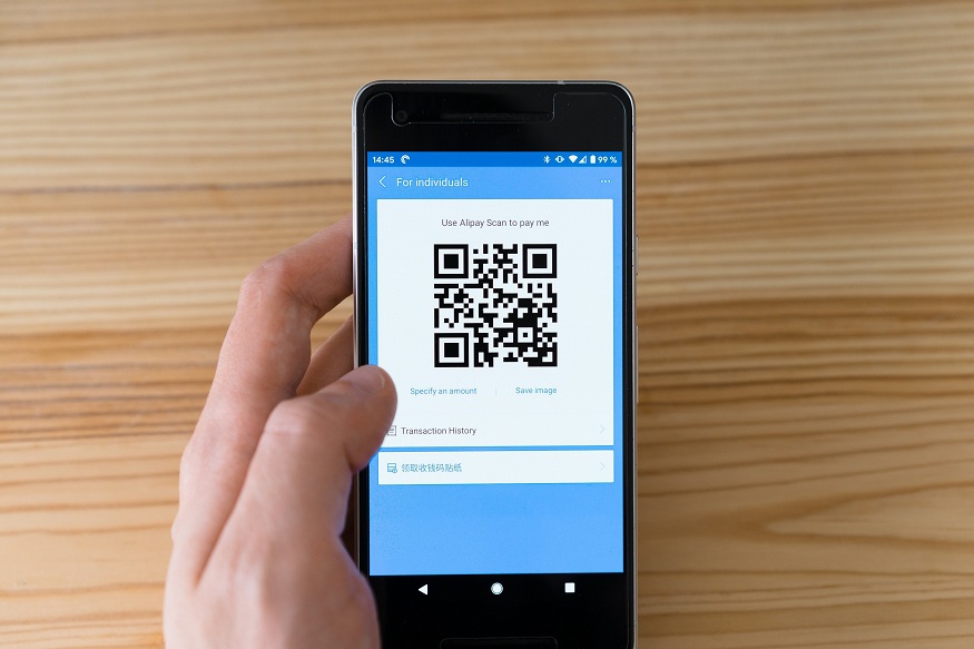
When the journey from opening the app to seeing a success message is seamless, it builds a sense of efficiency. For example, the scan and pay feature is a masterpiece of functional design. It eliminates the need to type in long account numbers or search for contacts. By simply pointing a camera at a code, the user initiates a complex financial transfer in a way that feels incredibly simple.
This simplicity is vital for bringing new users into the digital ecosystem. People who are not tech-savvy may be intimidated by complex banking procedures. A straightforward interface removes these barriers. When a person finds that they can navigate the UPI app without help, their confidence in digital payments grows significantly.
The Power of Immediate Confirmation
In the world of digital finance, silence is the enemy of trust. When a user sends money, they need to know immediately if the transaction worked. This is why real-time feedback is a cornerstone of interface design. A spinning wheel that lasts too long can cause a user to panic and wonder if their money has disappeared into a void.
Read More: Setting Up Your UPI App Safely for Smooth Payments
To combat this, designers implement clear confirmation screens. The moment a payment is processed, a large green checkmark usually appears. This visual confirmation is often accompanied by a distinct sound or a haptic vibration. These sensory cues provide instant gratification and relief. They close the loop of the transaction and reassure the user that the task is finished.
Furthermore, digital receipts that are easy to find and read add another layer of security. Knowing that a history of every transaction is stored and accessible at any time makes users feel more comfortable. It provides a digital paper trail that mirrors the physical receipts people have relied on for generations.
Navigating Technical Failures with Clarity
No system is perfect, and technical glitches are inevitable. However, the way a UPI app handles these failures can either break or build user trust. A cryptic error code like “Error 505” is frustrating and scary for most people. It does not explain what happened or where the money is.
Effective design uses human-centered language to explain problems. Instead of technical jargon, a good interface will say something like “The bank server is temporarily busy” or “Please check your internet connection.” This transparency helps the user understand that the issue is not necessarily their fault or a permanent loss of funds.
Providing clear next steps is also essential. If a payment fails, the app should immediately tell the user whether the money was deducted or if it will be refunded within a specific timeframe. When users feel informed during a crisis, they are much more likely to try again later rather than abandoning the platform entirely.
Designing for a Diverse Audience
The success of UPI is largely due to its reach across different demographics. This means the interface must be inclusive. Designers must consider users who speak different languages, have varying levels of literacy, or have physical disabilities. An interface that only works for young, tech-literate city dwellers will never achieve true national confidence.
Multilingual support is a key part of this inclusive design. Allowing a user to interact with their UPI app in their native tongue makes the process feel more personal and less intimidating. It reduces the chance of a user making a mistake because they misunderstood a prompt in a foreign language.
Accessibility features, such as high-contrast modes and adjustable font sizes, also play a role. Large, easy-to-tap buttons help those with limited dexterity. By making the app accessible to everyone, designers signal that digital payments are a public utility meant for the entire population. This broad usability fosters a collective confidence that strengthens the entire financial network.
The Future of Interface Innovation
As technology evolves, the way we interact with a UPI app will continue to change. Voice-activated payments and biometric authentication are already becoming more common. These innovations aim to make payments even more natural and secure. The goal remains the same: to make the digital experience feel as reliable as physical cash.
The relationship between design and trust is dynamic. As users become more comfortable with basic features, designers can introduce more advanced tools for budgeting and investing. However, the foundation will always be a clear, honest, and responsive interface. By prioritizing the user experience, developers ensure that the shift toward a cashless society is built on a solid foundation of public confidence.


Leave a Reply
You must be logged in to post a comment.